Porcelain, once dubbed “white gold” after being reproduced by an eighteenth-century Saxon alchemist, may seem to us today like a quaint rarity, a beautiful relic confined to elegant china cabinets. But in Suzanne Marchand’s absorbing history, this translucent ceramic comes to life as a once-ubiquitous commodity linked to geopolitical upheaval and the global transformations of the last three centuries. Through porcelain, we can see shifting patterns of consumption and production, the beginnings of capitalism and industrial society, and the rise of the middle class. “Economic histories,” Marchand writes, “do not need to be dry, and this one, it is hoped, makes it all the easier to understand the origins of the European consumer marketplace by coating it all in the translucent splendor of porcelain.”
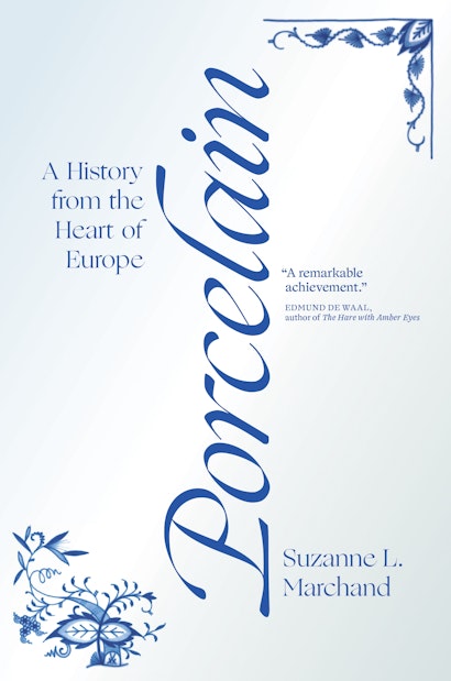
In that light, it is fitting that a book about porcelain would so faithfully mimic its subject in its design—down to its Meissen pattern and gloss. I spoke with creative director Maria Lindenfeldar about the complete design of Porcelain.
There’s a kind of mimesis at work in the book’s jacket design—form imitating content. How did you arrive at this concept?
ML: Because the book uses material culture to explore history, I wanted there to be a tactile and immediate feel to the packaging. Rather than simply depicting a plate or other representative object, I wanted the cover to appear as much like a piece of porcelain itself—thus the glossy white background and hand-painted details.
The design evolved through multiple iterations. What was the team aiming for with each successive round?
ML: Interestingly, we ended up very much where we started. The first sketches used the same vertically-oriented typography as the final version but on a completely stark white ground. The designer, Jason Alejandro, chose Ogg, a beautiful calligraphic typeface that has an expressive dash-like tittle above the “i.” While we all loved the typeface, there was some concern about legibility (the swash-like dot and vertical type raised some concerns among our team). Also, the plain white cover felt a bit too stark. In response, we modified the Ogg tittle to look like a traditional dot and explored placing the type horizontally.

In addition, we added corner details that are abstracted versions of the classic Blue Onion porcelain pattern that has been manufactured by Meissen since 1731. This approach was still considered too abstract by some, and we decided to print a much more conservative alternative design in our catalog.

Based on feedback from our sales reps, we reverted to the more abstract concept, choosing the vertical type option with a blurb added.

Because I loved the idea of juxtaposing this restrained and elegant cover against the exuberant images on the endsheets and interior, I was very happy when we returned to the original concept.
The design transcends its functionality and attains aesthetic value. Tell me about the book’s production values.
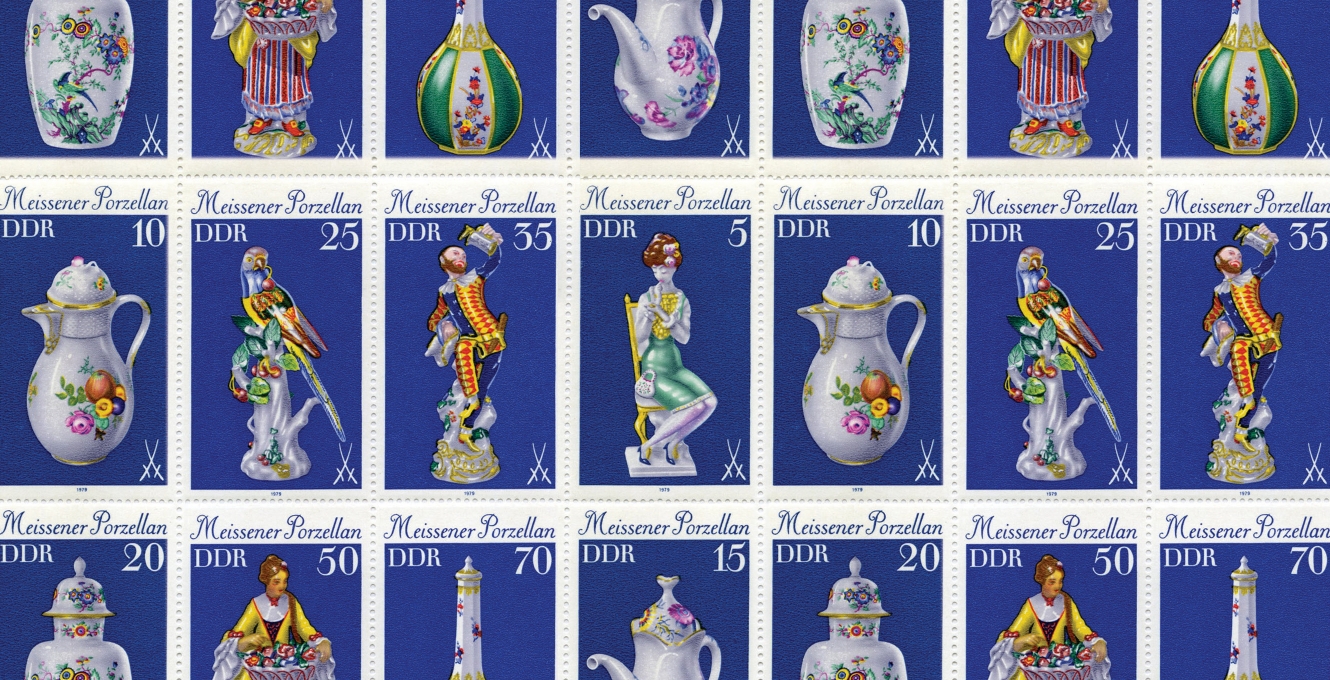
ML: We designed this project as a “book-as-object,” meaning that we wanted the package (cover coating/binding materials/headbands/endsheets/paper) to be carefully coordinated. We were fortunate to be able to afford four-color printed ends for this one. As artwork for the endsheets, we used a sheet of stamps that featured a range of Meissen pieces. Nothing about the production was particularly expensive or complicated, but it was all very carefully coordinated. I really like when there is a bit of a surprise element to a design. In this case, the reader gets a little sensory jolt; the quiet cover contrasts with the over-the-top endsheets—like a bright patterned lining on a carefully tailored blazer.

The vertical placement of the title is unique. According to Jason [the designer of the book jacket], turning a title on its side had been a career-long dream. What inspired this innovative decision?
ML: Porcelain is a very long word, and it needed to do a lot of the heavy lifting design-wise. By orienting it vertically, we were able to make the letters larger, allowing their beautiful forms to be the focus of the cover.
Tell me about the crafting of the interior. How did it parallel the design of the cover?
ML: We are lucky to have a team of very experienced text designers at the Press. In this case, Carmina Alvarez adapted the book’s front matter and text design to reflect the cover, repeating the typography on the title and half title pages, and sustaining a similar mood throughout the book’s interior. Carmina prepared the endsheets and chose the binding materials as well.

It comes together beautifully. And your thoughts on porcelain itself?
ML: I have a mini-collection of porcelain and stoneware that takes up way too much space in my house. My two favorite sets have sentimental value: twelve place settings of Rosenthal Medley that my mom brought back piece-by-piece in 1967 when she was a Pan Am stewardess flying the Frankfurt route, and a set of Wedgwood Queensware that my grandmother splurged on in the 1950s. That set is particularly interesting as the service pieces show the distinct influence of mid-century modernism on what is otherwise a very traditional design. I am also very proud of my “Valencia” plates designed by Ulla Procopé for the Finnish company Arabia in the 1960s. I covet the matching teapot. Also on my wish list is anything in Royal Copenhagen Blue Fluted Half Lace—a pattern that has been in production since 1775. Perfection!
Christopher Lapinski is the design coordinator for the Creative Media Lab. Maria Lindenfeldar is the Creative Director at Princeton University Press.