


Adjusting to pandemic life in the past two years, we’ve learned new ways to live, work, innovate, and flourish. Despite uncertainty, we’ve done great things, shown abounding resilience and creativity. In 2021, even with continued disruptions to normal life, social relations, supply chains and workplaces, we’ve remained intact. The past year has been challenging, but Princeton University Press has pressed on, fulfilling its mission and serving its community. Evidence of that commitment is the splendid array of our recently published and upcoming books, and the brilliant work of our book designers and artists. Leveraging their talent on topics ranging from mushrooms to material technologies, animal dreams to dreams of the future, the secret body to the secret syllabus, and good sailing to bad thinking, they’ve shown no lack of imagination or craftsmanship.
Here, in their own words, our in-house designers and art directors reflect on their favorite PUP covers of the year.

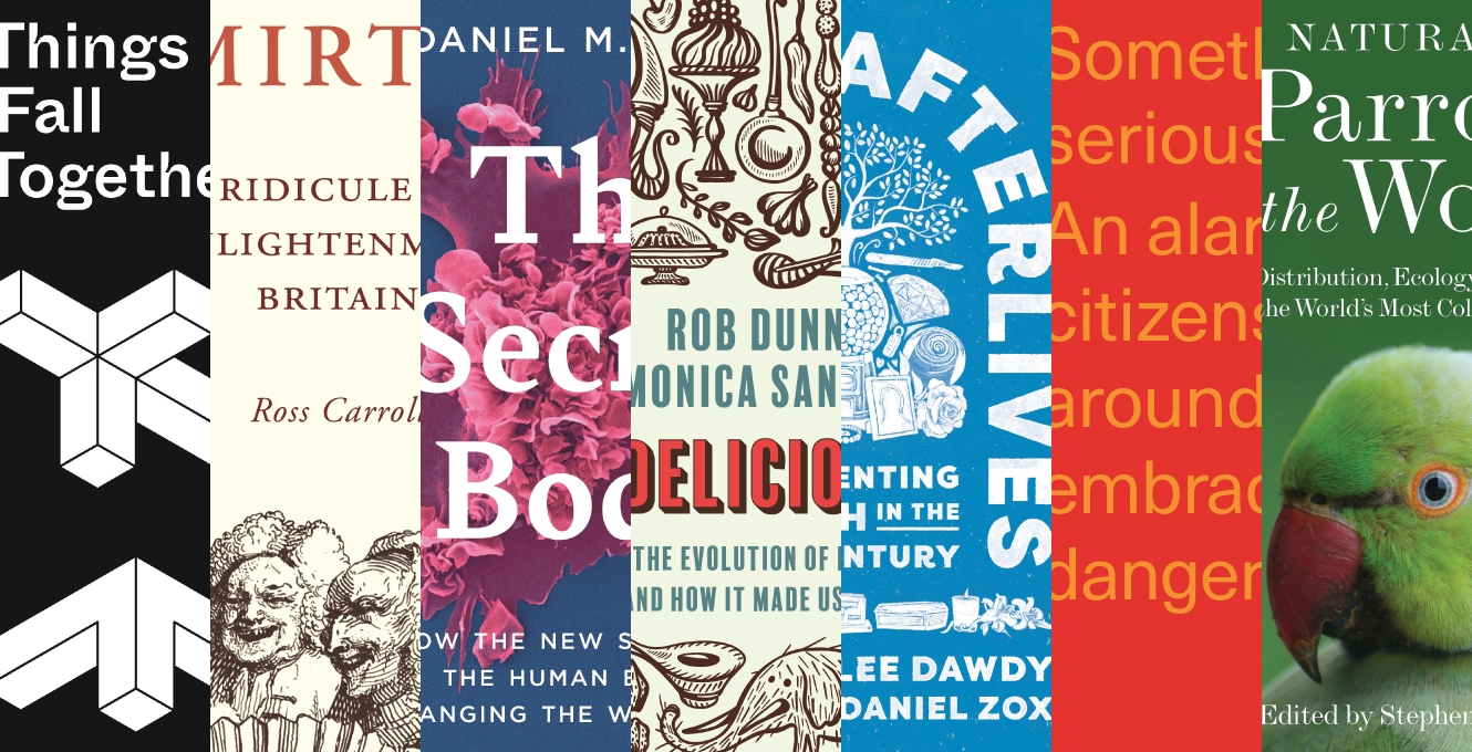
Things Fall Together: A Guide to the New Materials Revolution
Designer: Chris Ferrante
CF: In this book, Skylar Tibbits, founder of the Self-Assembly Lab at MIT, explains the core principles of active and programmable material technologies. The book’s title is a play on a common colloquial definition of entropy (“things fall apart”) and evokes the concept of self-assembly. Since the book is as much about science as design, it was important for the cover to communicate that intersection, visually conveyed in part by the black-and-white color palette and diagrammatic style of the illustration. I created a simplified, isometric rendering of this fluid-assembly chair—a project which demonstrates how a utilitarian object can be formed by autonomous assembly in complex and uncontrolled environments (water, air, space, etc.). The front cover features the six parts of the chair arranged as if “falling together” (or randomly tumbling in a tank of water), while the fully assembled chair is included on the back cover. The typeface I chose is Whyte Inktrap, which has notches in the corners of letterforms that—if imagined as three-dimensional—could be inserted into each other to form structures not unlike the self-assembling chair.

Uncivil Mirth: Ridicule in Enlightenment Britain
Designer: Felix Summ
FS: Uncivil Mirth is the first cover I designed at Princeton University Press and it is also my favorite cover that I designed in 2021. It was a joy to research work by the artists William Hogarth and Thomas Rowlandson in order to create the cartoon collage. The typography, set in Adobe Garamond, is meant to be reminiscent of letterpress books and pamphlets from eighteenth-century Europe. My favorite part of the cover is actually a portion of the cartoon that wraps around to the back cover to reveal a lone character laughing to himself.

The Secret Body: How the New Science of the Human Body Is Changing the Way We Live
Designer: Heather Hansen
HH: The Secret Body reveals the invisible, secret universe within each of us. It is a gripping drama of discovery and a landmark account of a revolution in human health. Bill Bryson, author of The Body: A Guide for Occupants, endorses the book as “a perfect blend of cutting-edge science and compelling storytelling.” That description is evoked in the cover image, which features a scanning electron micrograph of a human immune cell—rendered in stunning color, making the invisible visible. We see the cell in action, larger than life, poetically blooming as the story and science of human health open up to us. The large title in Bely aims to give the cover the feel of a novel, capturing the narrative quality of the book. At my local bookstore, Kepler’s Books in Menlo Park, California, the book is featured face out on the science shelves, an invitation to read about the magic inside each of us.

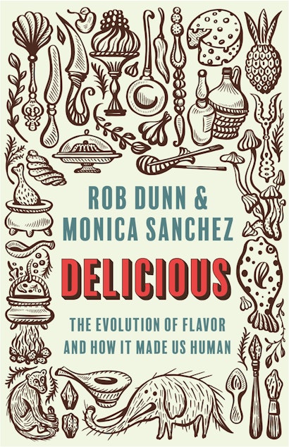
Delicious: The Evolution of Flavor and How It Made Us Human
Illustrator: Natalya Balnova
Art Director & Designer: Jess Massabrook
JM: The design challenge here was how to show the evolution of food without showing the cliché rendering of a primate evolving into a human. In discussion with the illustrator, Natalya Balnova, I suggested that we use a number of different tools associated with eating—whether the materials used to cook or the utensils humans have used to feed themselves. From there, Natalya came up with a composition that included all those things, plus a couple of animals and foods with a blank space for the type. Once the illustration was done, it was a matter of setting the type in a way that felt like a natural fit within the space and was also eye-catching in its own right while letting the illustration do much of the work of explaining what the book is about.

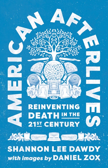
American Afterlives: Reinventing Death in the Twenty-First Century
Designer: Karl Spurzem
KS: Of all the reasons I like this cover, I’m featuring it here because it was just fun to make. I wanted to experiment with a handmade shrine or memorial, in keeping with the stories in the text—something personal and idiosyncratic and made with care. The artwork started as a collage of objects featured in the book that I painted digitally in Procreate. The layout was inspired by that classic tombstone arch shape and the first edition cover of Slaughterhouse-Five. Thankfully, when I presented my nearly illegible and intensely pink sketch alongside some (very!) different designs, the team liked it enough to let me repaint and refine it. Now it’s one of my all-time favorite projects. Maybe I’m being sentimental, and maybe that’s all part of the concept too.

When Bad Thinking Happens to Good People: How Philosophy Can Save Us from Ourselves
Designer: Amanda Weiss
Art Director: Maria Lindenfeldar
ML: After several attempts to use an image for this cover, we chose two lines from the book to serve as the “art.” The orange and red color scheme (high chroma but low contrast) allowed us to make the type bigger than the white title/subtitle/author group. I like that the hot color and minimal design combine to feel like a warning sign.

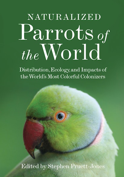
Naturalized Parrots of the World: Distribution, Ecology, and Impacts of the World’s Most Colorful Colonizers
Designer: Wanda España
WE: This cover design came easily to me once the image was approved. I knew I wanted to find an arresting photo of a parrot, and once I found the image of a rose-ringed parakeet, it just felt right. I love the way the bird seems to be interacting with the viewer—the fine feather details are so striking. Design-wise, I simply extended the background color above the parakeet’s head in order to place the elegant title right above.
Christopher Lapinski is the Art & Design Coordinator for the Creative Media Lab.